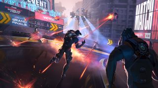
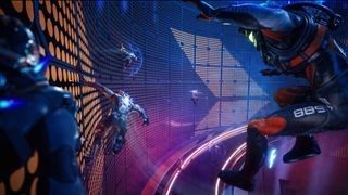
Deathsprint 66 is a new futuristic racer from developer Sumo Digital, built using Unreal Engine 5 and gunning for the same track pioneered by games like WipEout (one of the best video games of the 90s) and parkour hits such as Ghostrunner 2.
The game releases later this year, and is a violent, dystopian glimpse of a future where runners literally fight to the finish line in a game that blends free-running, combat and racing. Crucial to bringing Deathsprint 66 to life has been a 360-degree branding campaign from specialists Fluid, its clients include PlayStation, Netflix and Warner Bros. The team created the name ideation, logo and key art as well as crafting the website design and trailer.
Deathsprint 66's creative has been a multi-channel campaign fashioned by one studio with specialist in-house artists and designers that draws on retro logo design, reflects on sci-fi movies and pitches the game as a sports brand yet to be made. Below I ask James Glover, creative director and managing director at Fluid, how it was made and what it takes to make it as a branding artist in video games.

What inspired the logo and font choice?
James Glover: The strategic direction for the logo was simple: clean lines, a moody retro futuristic vibe, with a high octane sporting / lifestyle look and feel. These days, game logos have to exist in a huge array of media properties - often in small, crowded environments - so it’s vital to be distinctive and adaptable, working effectively to convey key messages.
Logo and name ideation grew and evolved together. During the name ideation process, we found our clear favourite - Deathsprint - worked best alongside a number, to evoke the game’s futuristic setting, and to reflect the iconic naming conventions of major sporting events such as London 2012. [The number] 66 worked beautifully - close enough to ‘666’ to be redolent of a hellish scenario, whilst providing a visual bookend for the capital D, along with the added bonus of sibilance and repetition, for impact and recall.
The 6s have neat, clean, fast flowing lines, with go-faster stripes adding dynamism and a sporting aesthetic. The font itself is adapted and modified from a pre-existing typeface, chosen for its clean, simplistic, striking lines. Whether stacked or long form horizontal, the bespoke logo lockups serve as the perfect visual shorthand for the entire campaign messaging.
How did you translate the game developer's vision into the key art and campaign look?
JG: The gameplay pillars - jockeying clones, the quest for fame, and the spectacle of a futuristic high speed death race, translated directly into core elements of our visual identity. The creative positioning was key in defining our route: our creative had to sit in the nexus of sporting entertainment, lifestyle and games - where danger meets velocity.
In terms of look and feel, we knew from the outset that we wanted to infuse the creative with an entertainment lifestyle vibe - this is about the spectacle of a sporting event, rather than viewing this through the lens of a traditional game.
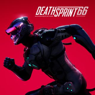
The best solutions are always the simplest - consumers need the immediacy of very direct messaging to cut through the daily barrage of competing visual noise. Our distinctive visual assets place the iconic character of the clone front and centre, the athletic hero of the piece, and the creative composition is clean, stark, slick, hard edged and futuristic, with one signature shade of almost neon red as a unique identifier.
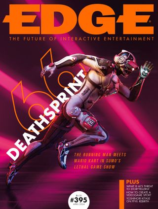
What inspired the Deathsprint 66 key art?
JG: In the initial stages, we played around with integrating environments, other runners, shadows and so on - but a stripped back visual felt much more dramatic and impactful, more iconic, more voyeuristic - akin to watching athletes compete in sporting events, rather than a typical gameplay composition.
The pose felt absolutely right side on - so many games have key art oriented front-on, so differentiation by creating distinct assets was important. It feels less obvious, and reflects the brand’s simplicity and minimalistic look and the fact that the clone races are part of a voyeuristic sporting spectacle.
Again, we asked ourselves, how would we approach this if the product were a piece of sports branding, rather than a game about a sport?
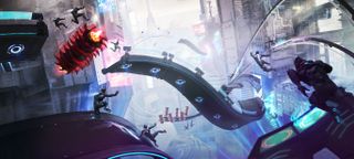
What processes go into turning a game screen into a piece of key art?
JG: In the preliminary stages, we review the brief and available assets, looking at competitor IP, macro and micro factors, key influences and so on, and from there we build out our strategy, and the core creative pillars for the campaign.
Then, importantly, we take a step back as a team and objectively view our first stage designs, to ensure we’re hitting our brief with our messaging. Sometimes it’s about stripping back to the core of an idea, and with Deathsprint, we had to hit our touchstones of sports branding and iconography, and ensure that everything in the image serves a purpose.
We then take forward three-to-four concepts to review with the client team. Once our Account Lead and Creative Strategist have a client-approved concept, the lead designer and art director work together with the team to begin producing final assets.
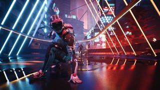
How did you unify everything as a brand, from logo to art and website?
JG: Colours and sporting lines were key; the unifying red / neon colour palette ties each creative touchpoint together. Our brand guidelines focus on the trifecta of our design: the iconography of the character, the moody futuristic neon atmosphere, and high octane sporting action. In terms of design, our aesthetic is clean, stripped back, sporting.
Each execution has that at its heart - so where the website affords us more space and visual dwell time, we incorporate ominous, moody, pulsing lights that bring a sense of urgency, whilst retaining clean structure and mechanical lines to frame our central iconic clone - it’s important not to over complicate, even where - in theory - you have the space to do so.
The site’s stripped back futuristic aesthetic cements the game’s signature blend of dark, dramatic sport and lifestyle vibes.
What software do you use to create key art?
JG: For this project, the process was slightly different in that we were also creating the trailer at the same time.
For the key art we used models provided by the games development team. We then used Substance Painter to re-export the original textures at a higher resolution and formatted to fit within our render pipeline. From there, we use Cinema 4D and Redshift for posing, composition and lighting. Once we’re happy, we move to Photoshop for all post FX, paint over and colour grading.
For the trailer, we produced some additional bespoke assets using Cinema 4D for all modelling, then Substance Painter for materials and texture. This was then imported into Unreal engine 5 for lighting and rendering.
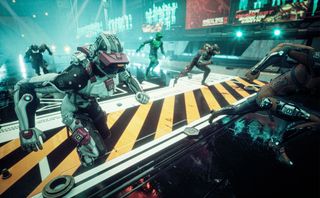
What references did you use for the campaign, for example was WipEout an inspiration?
JG: We started with a series of mood boards for each of our key genres. We wanted apocalyptic environments - think classics such as Bladerunner - we also wanted iconic, tense, futuristic character poses and lighting - think Ex Machina, and the side-on action poses from big brand sport ads.
We looked at the lighting and art direction of a range of fashion, lifestyle and movie creatives. In terms of games, yes, WipEout featured, but we also considered a diverse range of others - from Mario Kart, since the game is a racer - to the more lifestyle sports games such as SSX, Forza, and so on.
But ultimately, our presentation for Deathsprint feels very different to any game creative. It could happily sit alongside film, TV, fashion or sport; in fact, it's really at the nexus of all of those genres, and so we drew from a wide pool of visual imagery to influence the final direction.
What skills do artists need to create good key art and game campaigns?
JG: In terms of game development - experience is absolutely not a necessity. It can almost be a red herring. Sometimes, the more you know about game dev the better - but for us, being steeped in gaming can make your design and thinking too obvious.
Taking a step back is beneficial. Gamers aren’t the distinct, homogeneous market segment they (wrongly) were seen as 25 years back. Now, we’re all looking for entertainment - be it through gaming, films, social media, all of which blend and intersect and overlap. Being too far involved in gaming can rob you of a holistic view of the entire entertainment space, it can make your approach too blinkered. That’s why we see so many executions that are very similar, which don’t stand out, and have no distinctive brand assets or visual positioning.
A wider creative knowledge gives a wider field of inspiration, and that’s key - just focusing on the game can lead to a narrow response. Entertainment is entertainment - we have clients across fashion, music, TV, film, and gaming, and our thought process informs our design across each.
Everything comes back to that one consumer focused question - will this pique my interest and be worthy of the investment of my free time - be that watching, gaming, wearing, shopping, sharing, exploring, an activity, a sport, and so on. Great design transcends.
What advice would you give to artists who want to get into advertising, game art and design?
JG: You need to be a generalist - that’s absolutely beneficial. You don’t need to know games to get into games. It’s a disadvantage to be pigeon holed, in terms of your creative skillset, design capability and your favourite genre. Projects vary so much, and the media landscape varies and evolves so fast, we have to be multi-disciplinary and adaptable.
In terms of a campaign, of hitting marketing and strategic objectives, being able to cover all aspects of design, to take a broad view of the objective and purpose of design, ensures consistency which increases impact and salience. And that’s at the heart of a successful creative campaign.
What aspect of the Deathsprint 66 campaign are you most pleased with?
JG: That’s like choosing a favourite child! Honestly, all of it - each element is a part of one whole, each deliverable is consistently tuned in with their objectives. It’s a very coherent campaign… but the trailer works beautifully - the timing, the visual and audio beats, it’s the most engaging and immersive asset type and I love how it draws the viewer in.
Find out more about Fluid and the campaigns they create for some of gamings' biggest releases. If you want to learn more about the software used for the Deathsprint 66 campaign, read our explainer to Cinema 4D and our recommended best digital software.
Get the Creative Bloq Newsletter
Daily design news, reviews, how-tos and more, as picked by the editors.


