In this workshop I’ll be focusing on some of the techniques I use for adding dramatic lighting and shadows. We’ll start from the early sketching stages, all the way through to the completed illustration. I’ll be explaining what to keep in mind such as light sources, lighting figures and surroundings when drawing and painting them. We’ll also be looking at shadows and how to use them for storytelling and movement in your artwork.
For this piece, I’ll be using the painting software Krita and will explain the default brushes I used for this illustration, and how to give the finished piece extra life using a filter layer. Almost all of my work is figurative-based and having a basic understanding of anatomy will really help you when it comes to adding dramatic lighting to enhance figures. This practice will greatly benefit you when you begin to paint your illustrations. Okay, so let’s get stuck in!
01. Create initial sketch idea
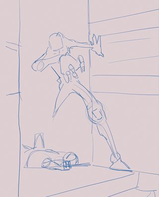
When starting an illustration I’ll keep it very simple, defining the basic shapes with simple lines to build up the composition I have in my head. There’s no right or wrong way to do this and it’ll involve a lot of trial and error. If something doesn’t work, then don’t hesitate to bin it and start again. Essentially, it’s a rapid brain dump of ideas until I’m happy.
02. Build the composition
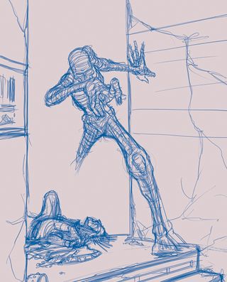
From there I’ll work into the sketch, starting to map out the figures and surroundings. Working with a strong light source can be scary, knowing where to use black, and where not to, will ultimately define the image. Here the background and wall shadows will be mostly black so there’s no need to draw any details in those areas. They’ll be mapped out in the next stage
03. Figure out the placement of your light source
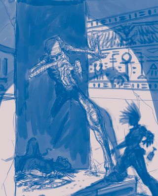
Deciding where the light source is positioned will dictate where the shadows fall on the figures and are cast on the surroundings. In a separate layer, I’ll go and quickly block out the blacks and shadows using a dry bristle brush at a medium size. This helps me to see where the focal points will be, and which parts will need to be detailed when I draw the outlines.
04. Draw up the outlines of your sketch
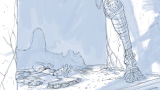
Now comes a fun bit: detailing the outlines from the messy rough. As I’m going to have some parts in near darkness, there’s no need to draw any details there. It’s just suggesting shapes to define what it is, only detailing the parts that will be well-lit in the illustration. At this stage I’ll keep all the main parts in separate layers for the ease of shifting parts around.
05. Turn the lights on
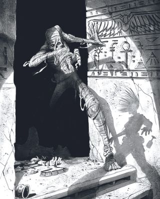
Once the outline is done, I’ll flatten the layers and make a new layer for the shadows. The main light source won’t be visible in the illustration, but it’ll dictate how the shadows will fall on the walls. I’ll use the dry brush for the hard-edged shadows and a spray brush at varying sizes to add tone, textures and fades.
06. Add the base colours
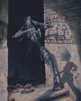
Once I’m happy with the outline and shadows, I’ll flatten them into one layer and begin adding base colours in a new layer beneath it. This speeds up my workflow as I can make any adjustments before I paint on top of the outline. I’ll use a mixture of Krita brushes, including both wet and dry brushes and the spray brush, keeping it loose and messy as I add colour.
07. Define the focus areas
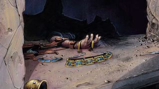
From here I’ll begin defining the main focal points in a new top-level layer, primarily utilising dry and spray brushes to work in the details. My preferred approach involves minimal layer usage, typically with a top-level colour layer, an outline/shades layer, and an undercolour layer at the bottom. This makes it easier for adjustments throughout without being bogged down by too many layers.
08. Add detail to the wall shadows
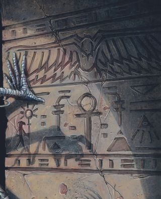
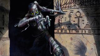
I like to guide the eye around the illustration to tell the story, and here I use hieroglyphs to link the shadow figure and mummy. I’ll use a watercolour texture brush in Krita at varying sizes for the wall textures, overlapping the brushstrokes to give depth. Then adding some details and defining edges with the dry brush. Backgrounds are typically looser, giving the main focal parts more pop.
09. Create the shadowy figure
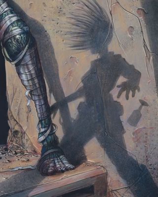
I wanted the third figure in the piece to only be a shadow on the wall. This dictates that there’s no detail to add, but instead we create movement in the hair and pose to give the figure some life. As the figure is on the wall, I made sure the wall texture can still be seen by darkening the cracks and adding subtle highlights.
10. Paint the mummy
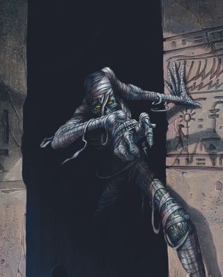
With the mummy being the main focal point of the illustration I’ll spend more time here refining it. I’ll initially add the glow in the eyes and pay more attention to the areas that are well-lit, leaving the parts that are in shadow looser so they don’t pull your eye away from the main parts of the mummy character.
11. Deal with the dark
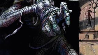
As we’re using dense shadows and deep blacks, we need to make sure things don’t get too heavy. To deal with this I’ll add in some subtle ambient lighting to define the darker areas of the mummy. As this isn’t a main focal area, we can subtly suggest shape and form with minimal detailing needed.
12. Refine what lurks in the shadows
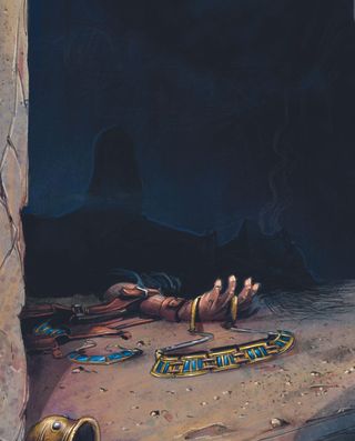
Using the light source we’ll reveal part of a background figure, with the rest of that figure in deep shadow. To define the body shape I’ll add a subtle blue to make the dark areas more visible. Where the figure’s head is closer to the light, I’ll loosely define some facial features in the same subtle blue.
13. Add the good stuff
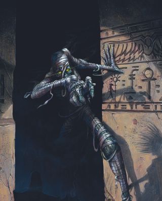
This is where the image really comes to life, by adding all the little extras from smoke to the glowing eyes. This makes the wall and hieroglyphs a little more defined, and adding those small details tightens up the smaller focus areas like the wall texture and crack highlights. I usually do these with the dry brush at small sizes with different opacities, creating depth in those details.
14. Make individual colour adjustments
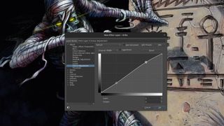
The illustration is complete, but sometimes a slight colour adjustment may be needed. This will be different for everyone depending on your requirements. Here I used a filter layer at the top level, enabling a small RGBA adjustment for the entire image. By locking the darker tones on the curve and subtly enhancing the lighter end, the overall image gains a more contrasting pop.
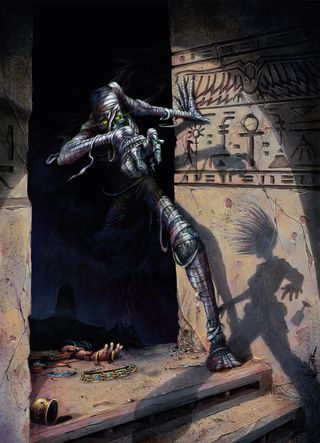
This article originally appeared in ImagineFX. Subscribe to the magazine at Magazines Direct.
Get the Creative Bloq Newsletter
Daily design news, reviews, how-tos and more, as picked by the editors.
